A powerful and feature-rich table layout extension for Directus 11+ that enhances the default table view with advanced functionality including inline editing, quick filters, bookmarks, and custom cell rendering.
See CHANGELOG.md for version history.
Display and edit translations in multiple languages simultaneously as separate columns. Perfect for managing multilingual content with ease.
Rename table columns on-the-fly without changing the underlying field names. Create user-friendly labels for better readability.
Create custom filter buttons with personalized colors and icons for instant data filtering. Visual organization at its best.
Powerful search functionality across all table fields, including nested relations and translations. Find anything, anywhere in your data.
Switch seamlessly between read-only view mode and interactive edit mode. Control when and how users can modify data.
Smart image handling with an enlarged hover preview, proper aspect ratios, and a built-in file browser for selecting media files directly from table cells.
Duplicate items with all their relationships and translations. Perfect for creating variations of complex data structures.
Render polymorphic Many-to-Any relationships directly in the table — built straight from the native field picker or by hand. Use {{item:<collection>.<field>}} for a target's fields (nested chains like {{item:partners_catalog.catalog_id.title}} work), {{collection}} for the discriminator, and bare tokens like {{code}} for parent-row fields. Each junction row resolves against its own target collection.
- Custom Cell Rendering - Specialized display for different field types
- Relationship Support - Handle M2O, O2M, M2M, M2A relationships with deep data access
- Image Preview - Inline image display with an enlarged hover preview and file browser
- Tag Support - Automatic detection and display of tag fields as visual chips with inline popover editor for adding/removing tags
- Status Indicators - Visual representation of boolean and select fields
- Translation Support - Display multiple language translations as separate columns
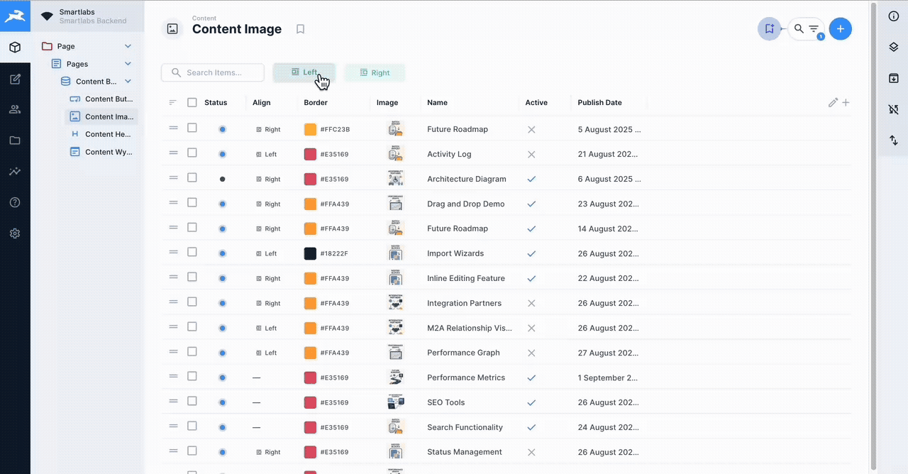
- Column Alignment - Configurable text alignment per column (left, center, right)
- Native Pagination - Server-side pagination with selectable page sizes (25, 50, 100, 250, 500, 1000; default 25)
- Separate Count Query - Item count is fetched independently so the table still renders when the count query is restricted by permissions
For detailed information about installing extensions in Directus, see the official documentation.
Install the extension using your preferred package manager:
# Using pnpm
pnpm add directus-extension-super-table

# Using npm
npm install directus-extension-super-table

# Using yarn
yarn add directus-extension-super-table
After installation, restart Directus to load the extension:
# If using Docker
docker-compose restart directus

# If running locally
npx directus start-
Clone or download the extension to your Directus extensions folder:
cd /path/to/directus/extensions git clone https://github.com/smartlabsAT/directus-super-table.git -
Install dependencies:
cd directus-super-table
pnpm install  # or npm install
-
Build the extension:
pnpm build # or npm run build -
Restart Directus to load the extension
- Open a collection in the Directus Content module
- Open the layout dropdown in the sidebar
- Select "Super Table" as the layout
- Configure the layout options in the Layout Options sidebar panel
Quick Filters provide fast access to frequently used filter combinations:
- Creating a Filter: Click the "+" button in the Quick Filters section
- Configure Filter: Set field, operator, and value
- Save Filter: Give it a name and optional color
- Using Filters: Click filter buttons to toggle them on/off
- Filter States:
- Gray (OFF) - Filter not applied
- Blue (Active) - Filter applied with visual indicators
Edit data directly in the table without opening a separate form:
- Entering Edit Mode: Enable "Edit Mode" in the Layout Options sidebar (or the edit toggle in the table header), then click an editable cell
- Editor Types:
- Text fields: Simple input or WYSIWYG editor
- Boolean: Checkbox toggle
- Select: Dropdown menu
- Date/Time: Full date picker with calendar
- Color: Color picker with alignment support
- Image/File: File browser with larger previews
- Unified Header Actions:
- Save/Cancel buttons in the popover header for all field types
- Consistent UI across all editors
- Icon-only buttons matching native Directus style
- Saving: Click save button (✓) or press Enter
- Canceling: Click cancel button (✗) or press Escape
Note: Relational fields (M2O, O2M, M2M, M2A) are display-only and are not editable inline — open the item detail view to edit them.
Customize which columns are displayed and how:
- Add Columns: Click "+" button in the table header
- Remove Columns: Use column selector to hide columns
- Rename Columns: Right-click header and select "Rename"
- Reorder Columns: Drag column headers to reorder
- Resize Columns: Drag column borders to resize
Override how a column renders by attaching a display template, configured in the sidebar under Layout Options → Column Displays:
- Add a display: Click "Add Column Display", pick a column, and enter a template
- Edit / Remove: Click an existing entry to edit it, or the ✗ icon to remove it
- Templates use the
{{ field }}mustache syntax and may reference related fields
M2A fields are polymorphic — each junction row points at one of several target collections. Build the template straight from the native field picker (it now resolves correctly), or write tokens by hand. Tokens resolve per junction row; on a name clash the most specific (deepest) match wins:
{{item:<collection>.<field>}}— a field on a specific target collection; nested paths work, e.g.{{item:partners_catalog.catalog_id.title}}(M2A → M2O → value){{collection}}— the name of the row's target collection (the discriminator)- The field-key-prefixed forms the picker emits also work, e.g.
{{treatment.collection}},{{treatment.item:service.name}}, or a junction column like{{treatment.sort}} {{<parentField>}}— a bare token reads a field on the parent row, e.g.{{code}}shows the order's own code next to each item
Each junction row only resolves the item token whose <collection> matches its own
target, so a template can cover every allowed collection at once:
{{collection}}: {{item:partners_catalog.name}} {{item:service.name}}
The editor shows the allowed collections and an example for the selected field.
Save table configurations for quick access:
- Save Bookmark: Configure table, then click bookmark icon → "Save Current"
- Load Bookmark: Select from bookmark dropdown
- Update Bookmark: Load bookmark, make changes, save with same name
- Delete Bookmark: Right-click bookmark and select delete
super-layout-table/
├── index.ts                          # Extension entry point (defineLayout)
├── src/
│   ├── super-table.vue               # Main layout component
│   ├── options.vue                   # Sidebar layout options
│   ├── actions.vue                   # Row/bulk actions component
│   ├── components/
│   │   ├── InlineEditPopover.vue     # Inline editor popover
│   │   ├── QuickFilters.vue          # Quick filter management
│   │   ├── ColumnDisplaysSection.vue # Column-display list + editor
│   │   ├── ColumnDisplayEditor.vue   # Single column-display form
│   │   ├── EditableCellRelational.vue# Relational/M2A cell rendering
│   │   └── CellRenderers/            # Custom cell renderers (image, select, …)
│   ├── composables/
│   │   ├── api.ts                    # API operations (useTableApi)
│   │   ├── useAliasFields.ts         # Field aliasing logic
│   │   ├── useColumnDisplays.ts      # Column-display override CRUD
│   │   └── …                         # pagination, sort, permissions, translations
│   └── utils/
│       ├── adjustFieldsForDisplays.ts# Display field expansion (incl. M2A)
│       ├── displayHeuristics.ts      # Template tokenising + relation helpers
│       ├── resolveM2ARelation.ts     # M2A junction-shape resolver
│       └── getDefaultDisplayForType.ts# Default display mapping
├── tests/                            # Vitest unit tests
├── package.json                      # Package configuration
├── tsconfig.json                     # TypeScript configuration
└── README.md                         # This file
- Node.js 20+ (CI runs on 20.x and 22.x)
- pnpm package manager
- Directus 11.0.0+
# Install dependencies
pnpm install

# Start development build with watch mode
pnpm dev

# Build for production
pnpm build

# Run linter
pnpm lint

# Type checking
pnpm type-check

# Run all quality checks
pnpm quality

# Fix linting issues
pnpm lint:fix

# Format code
pnpm formatThis extension includes comprehensive GitHub Actions workflows for maintaining code quality:
Every push and pull request triggers automated quality validation:
- TypeScript Type Checking - Ensures type safety across the codebase
- ESLint - Enforces code quality standards (0 errors, 0 warnings)
- Prettier - Validates consistent code formatting
- Build Validation - Confirms the extension builds successfully
.github/workflows/
├── ci.yml              # CI/CD pipeline (build, test, quality on Node 20.x & 22.x)
├── quality-checks.yml  # Type-check, lint, format, build (push/PR)
├── test.yml            # Vitest unit tests
├── pr-checks.yml       # PR-specific checks with auto-comments
├── release.yml         # Automated release creation on version tags
└── badges.yml          # Status badge updates
You can run the same checks locally before pushing:
# Run all quality checks at once
pnpm run quality

# Individual checks
pnpm run type-check    # TypeScript validation
pnpm run lint          # ESLint checks
pnpm run format:check  # Prettier validation
pnpm run build # Build test- Create your feature branch
- Make your changes
- Run
pnpm run qualitylocally - Push to GitHub
- GitHub Actions will automatically validate your code
- PR will receive an automated quality report comment
The layout persists these options (those marked (sidebar) have a control in the Layout Options panel; the rest are set through table interactions):
{
  showToolbar?: boolean;          // (sidebar) show the toolbar with actions
  editMode?: boolean;             // (sidebar) enable inline editing
  directBooleanToggle?: boolean;  // (sidebar, requires editMode) single-click boolean toggle
  languageCodeField?: string;     // (sidebar) language-code field for translations (default 'languages_code')
  customFieldNames?: Record<string, string>;                 // per-column header label overrides
  columnDisplays?: Record<string, { template: string; display?: string }>; // per-column display templates
  showSelect?: boolean;           // show row-selection checkboxes
  spacing?: 'compact' | 'cozy' | 'comfortable';              // row height
  align?: Record<string, 'left' | 'center' | 'right'>;       // per-column text alignment
  widths?: Record<string, number>;                           // per-column widths
  quickFilters?: QuickFilter[];   // saved quick filters
}As a Directus layout, the component emits the standard layout sync events:
update:selection- When item selection changesupdate:layoutOptions- When a layout option changes (column displays, edit mode, alignment, widths, …)update:layoutQuery- When the query changes (fields, sort, page, limit)update:search- When the search query changes
The filter prop is consumed read-only (filtering is driven by Directus), so no
update:filter event is emitted.
Available composables for extension development:
useTableApi()- API operations wrapper (fetch, count, update, delete, export)useAliasFields()- Field aliasing for complex queriesuseColumnDisplays()- Per-column display-template overrides
- Chrome 90+
- Firefox 88+
- Safari 14+
- Edge 90+
Contributions are welcome! Please follow these guidelines:
- Fork the repository
- Create a feature branch
- Make your changes
- Add/update tests as needed
- Submit a pull request
- Use TypeScript with explicit types
- Follow Vue 3 Composition API patterns
- Maintain consistent code formatting
- Add JSDoc comments for public APIs
- Ensure the extension is in the correct directory
- Check Directus logs for errors
- Verify all dependencies are installed
- Try clearing browser cache
- Make sure "Edit Mode" is enabled in the Layout Options sidebar
- Check field permissions in Directus (no update permission = read-only)
- Ensure fields are not configured as read-only
- Note: relational fields (M2O, O2M, M2M, M2A) are display-only by design
- Choose a smaller page size (the per-page selector defaults to 25)
- Check the browser console for errors
See CHANGELOG.md for a detailed version history.
MIT License - See LICENSE file for details
For issues, questions, or feature requests, please create an issue in the repository.
Built for Directus 11+ by the community. Special thanks to all contributors and testers.