
A Flutter package to showcase / highlight your widgets step by step — perfect for onboarding tours and feature discovery.
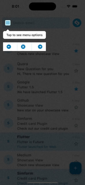
- Step-by-step highlight of any widget with an auto-positioned tooltip.
- Default tooltip (title + description) or a fully custom tooltip widget.
- Tooltip on any side — top / bottom / left / right — with full RTL support.
- Highlight any widget by its exact shape — circle, pill, star, icon — with
highlightExactShape. - Highlight multiple widgets in a single step (e.g. multi-select).
- Global tooltip styling via
ShowcaseStyle— set it once, not per step. - Built-in action buttons (Next / Previous / Stop) with customizable text.
- Built-in progress dots and a Skip button in the default tooltip.
- Auto-play, auto-scroll, and background blur.
- Programmatic control & progress:
next(),previous(),goTo(),dismiss(), "Step x of y". - Per-step lifecycle callbacks (
onShow/onDismiss) and configurable background-tap behavior. - Show the tour only once for onboarding, and auto-skip steps not on screen.
- Accessibility: keyboard navigation (Esc / arrows / Enter) and screen-reader announcements.
- Target interaction callbacks: tap, double-tap, long-press.
- Enable/disable the whole tour with a single flag.
- Add the dependency to your
pubspec.yaml(get the latest version from the 'Installing' tab on pub.dev):
dependencies:
showcase_tutorial: <latest-version>- Import it:
import 'package:showcase_tutorial/showcase_tutorial.dart';1. Wrap your screen (or app) in a ShowCaseWidget.
ShowCaseWidget(
  builder: Builder(builder: (context) => const HomePage()),
);
2. Wrap each target widget in a Showcase with a unique GlobalKey.
final GlobalKey _one = GlobalKey();
final GlobalKey _two = GlobalKey();

Showcase(
  key: _one,
  title: 'Menu',
  description: 'Tap here to open the menu',
  child: const Icon(Icons.menu),
);

Showcase(
  key: _two,
  title: 'Profile',
  description: 'Your account lives here',
  targetShapeBorder: const CircleBorder(),
  child: const CircleAvatar(child: Icon(Icons.person)),
);
3. Start the showcase (the order of keys is the order of the steps):
ShowCaseWidget.of(context).startShowCase([_one, _two]);To start it automatically once the first frame is rendered:
WidgetsBinding.instance.addPostFrameCallback(
  (_) => ShowCaseWidget.of(context).startShowCase([_one, _two]),
);When the default title/description tooltip isn't enough, build your own with
Showcase.withWidget:
Showcase.withWidget(
  key: _three,
  height: 80,
  width: 140,
  targetShapeBorder: const CircleBorder(),
  container: Column(
    crossAxisAlignment: CrossAxisAlignment.start,
    children: const [
      Text('This is a custom tooltip', style: TextStyle(color: Colors.white)),
      SizedBox(height: 8),
      Icon(Icons.touch_app, color: Colors.white),
    ],
  ),
  child: const Icon(Icons.star),
);Add navigation buttons to the tooltip with ShowCaseDefaultActions:
Showcase(
  key: _one,
  title: 'Menu',
  description: 'Open the menu',
  actions: const ShowCaseDefaultActions(), // Previous | Stop | Next
  child: const Icon(Icons.menu),
);
Customize each button with ActionButtonConfig:
Showcase(
  key: _one,
  title: 'Menu',
  description: 'Open the menu',
  actions: ShowCaseDefaultActions(
    next: ActionButtonConfig(
      text: 'Next',
      icon: const Icon(Icons.arrow_forward, size: 16),
      textDirection: TextDirection.rtl,
    ),
    previous: const ActionButtonConfig(text: 'Back'),
    stop: const ActionButtonConfig(text: 'Skip'),
  ),
  actionSettings: const ActionsSettings(
    containerColor: Colors.white,
    containerHeight: 40,
  ),
  child: const Icon(Icons.menu),
);Add a built-in step indicator and a skip control to the default tooltip — no
custom container needed. Both are set once on the ShowCaseWidget and default
to off:
ShowCaseWidget(
  showProgress: true,           // dots: one per step, active step highlighted
  showSkip: true,               // a "Skip" button that ends the whole tour
  skipButtonText: 'Skip tour',  // optional, defaults to 'Skip'
  builder: Builder(builder: (context) => const HomePage()),
);
The dots use the tooltip's text color and reflect currentIndex / totalSteps.
This only affects the default tooltip; a custom container tooltip is left
untouched (build your own indicator there if you want one).
By default the highlight is a geometric box you control with targetShapeBorder
(e.g. CircleBorder() for a round target). For irregular widgets — a star, a
pill, an icon, a logo — set highlightExactShape: true and the highlight hugs
the widget's actual painted shape automatically, with no targetShapeBorder
to match by hand.
Showcase(
  key: starKey,
  highlightExactShape: true, // highlight follows the star, not a box
  title: 'Favourites',
  description: 'Tap the star to save this item',
  child: const Icon(Icons.star, size: 48, color: Colors.amber),
);
How it works: the target is captured as a snapshot and drawn above the dimmed
overlay (the child is wrapped in a RepaintBoundary for you).
Note: while the step is showing, the target is rendered as a static image, so it won't animate or update until the showcase moves on. For typical static UI this is invisible.
targetShapeBorder/targetBorderRadiusare ignored for the highlight when this is on.
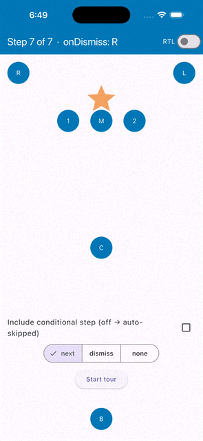
Sometimes one step should highlight several widgets at once — for example a
multi-select control, or a few non-adjacent items in a ListView. Pass the
extra widgets' keys to Showcase(keys: ...) and wrap each of those widgets in a
MultiView (a RepaintBoundary) so a snapshot of it can be drawn above the
overlay.
final GlobalKey mainKey = GlobalKey();
final GlobalKey extraOne = GlobalKey();
final GlobalKey extraTwo = GlobalKey();

// The primary target carries the tooltip and lists the extra keys.
Showcase(
  key: mainKey,
  keys: [extraOne, extraTwo],
  description: 'Tap the star to mark important emails',
  child: const MailTile(),
);

// Each extra widget is wrapped so it can be captured.
MultiView(key: extraOne, child: const SomeListItem());
MultiView(key: extraTwo, child: FloatingActionButton(onPressed: () {}));
Note: the extra widgets must currently be in the widget tree (rendered) when the step starts so their keys resolve. A widget that is missing is simply skipped — the remaining ones are still highlighted.
Instead of repeating the same tooltip styling on every Showcase, set it once
on the ShowCaseWidget with ShowcaseStyle. Each Showcase still overrides
any value it provides; anything left unset falls back to the style, then to the
built-in default.
ShowCaseWidget(
  style: const ShowcaseStyle(
    tooltipBackgroundColor: Color(0xFF023047),
    textColor: Colors.white,
    tooltipBorderRadius: BorderRadius.all(Radius.circular(12)),
  ),
  builder: Builder(builder: (context) => const HomePage()),
);
Resolution order for each value: Showcase → ShowcaseStyle → built-in default.
By default the package stores nothing, so the tour replays every time you call
startShowCase. To show it only once (typical onboarding), give the
ShowCaseWidget a showcaseId and an onShouldStartShowcase guard, and persist
completion yourself in onFinish — with any storage (shared_preferences,
Hive, a backend, …):
ShowCaseWidget(
  showcaseId: 'home_v1',
  onShouldStartShowcase: (id) async =>
      !(prefs.getBool(id!) ?? false),       // skip if already seen
  onFinish: () => prefs.setBool('home_v1', true),
  builder: Builder(builder: (context) => const HomePage()),
);
Call startShowCase([...]) as usual — it silently does nothing when the guard
returns false. The guard may be synchronous or asynchronous. To force a replay
(e.g. a "Show tutorial again" button), pass force: true:
ShowCaseWidget.of(context).startShowCase([_one, _two], force: true);Advance through all steps automatically:
ShowCaseWidget(
  autoPlay: true,
  autoPlayDelay: const Duration(seconds: 3),
  enableAutoPlayLock: true, // block taps while auto-playing
  builder: Builder(builder: (context) => const HomePage()),
);ShowCaseWidget.of(context).next(); // go to the next step
ShowCaseWidget.of(context).previous(); // go to the previous step
ShowCaseWidget.of(context).dismiss(); // stop the whole tourJump to a specific step and read progress — useful for a "Step 2 of 5" indicator or a skip-to control:
final show = ShowCaseWidget.of(context);
show.goTo(2);                 // jump to a step by index
show.goToKey(profileKey);     // ...or by its GlobalKey
final label = '${(show.currentIndex ?? 0) + 1} of ${show.totalSteps}';
final running = show.isShowcaseRunning;
Lifecycle callbacks on ShowCaseWidget:
ShowCaseWidget(
  onStart: (index, key) => debugPrint('started step $index'),
  onComplete: (index, key) => debugPrint('finished step $index'),
  onFinish: () => debugPrint('tour complete'),
  builder: Builder(builder: (context) => const HomePage()),
);Respond to taps on the highlighted widget. onTargetClick requires
disposeOnTap to be set:
Showcase(
  key: _one,
  description: 'Tap to open details',
  disposeOnTap: true,
  onTargetClick: () => Navigator.pushNamed(context, '/details'),
  onTargetDoubleTap: () => debugPrint('double tapped'),
  onTargetLongPress: () => debugPrint('long pressed'),
  child: const Icon(Icons.info),
);Each Showcase can report when it becomes visible and when it's left — handy
for analytics or per-step side effects:
Showcase(
  key: _one,
  title: 'Menu',
  description: 'Open the menu',
  onShow: () => analytics.log('tour_step_shown', {'step': 'menu'}),
  onDismiss: () => analytics.log('tour_step_left', {'step': 'menu'}),
  child: const Icon(Icons.menu),
);
onShow fires when the step becomes the active showcase; onDismiss fires when
it stops being active — advanced past, navigated away, or the whole tour ended.
By default, tapping the dimmed background advances to the next step. Change it
with barrierInteraction:
ShowCaseWidget(
  barrierInteraction: BarrierInteraction.dismiss, // tap background → end tour
  // BarrierInteraction.next    → advance (default)
  // BarrierInteraction.none    → ignore background taps
  builder: Builder(builder: (context) => const HomePage()),
);
The legacy
disableBarrierInteraction: truestill works and is equivalent toBarrierInteraction.none.
The active step is keyboard-navigable and announced to screen readers out of the box (both default to on):
ShowCaseWidget(
  enableKeyboardNavigation: true,   // default
  enableAutoAnnouncements: true,    // default
  builder: Builder(builder: (context) => const HomePage()),
);
Keyboard (web/desktop; harmless on mobile):
| Key | Action |
|---|---|
→ / ↓ / Enter |
Next step |
← / ↑ |
Previous step |
Esc |
Dismiss the tour |
Keyboard handling is focus-scoped: it only acts while the showcase overlay holds focus, so it never hijacks keys from the rest of your app.
Screen readers: each step's title and description are announced via
TalkBack / VoiceOver as it becomes active. Override the spoken text per step
(handy for a custom container tooltip with no title/description):
Showcase(
  key: _logo,
  semanticLabel: 'Your company logo. Double tap to go home.',
  child: const FlutterLogo(),
);// For all steps:
ShowCaseWidget(blurValue: 2, builder: ...);
// Or per step:
Showcase(blurValue: 2, key: _one, description: '...', child: ...);Force the tooltip to a side of the target with TooltipPosition.top,
.bottom, .left, or .right (defaults to whatever vertical space is
available):
Showcase(
  key: _one,
  description: 'Shown to the right of the target',
  tooltipPosition: TooltipPosition.right,
  child: const Icon(Icons.menu),
);
left/rightuse the default title/description tooltip; customcontainertooltips and action buttons keep top/bottom placement.
If some showcased widgets are rendered conditionally, enable
autoSkipUnmountedSteps so steps whose target isn't currently in the widget
tree are skipped automatically instead of showing an empty overlay:
ShowCaseWidget(
  autoSkipUnmountedSteps: true,
  builder: Builder(builder: (context) => const HomePage()),
);The tooltip inherits the ambient text direction, so RTL text (e.g. Arabic) is measured and laid out correctly when your app is RTL — no extra configuration needed.
ShowCaseWidget(
  enableShowcase: false, // every Showcase just renders its child, no overlay
  builder: Builder(builder: (context) => const HomePage()),
);| Function | Description |
|---|---|
startShowCase(List<GlobalKey> widgetIds) |
Start the showcase |
next() |
Go to the next step |
previous() |
Go to the previous step |
dismiss() |
Dismiss all showcases |
| Name | Type | Default | Description |
|---|---|---|---|
| builder | Builder | required | Builds the subtree that contains the Showcase widgets. |
| style | ShowcaseStyle | const ShowcaseStyle() |
Default tooltip styling for every Showcase in the tree. |
| blurValue | double | 0 | Gaussian blur applied to the overlay. |
| autoPlay | bool | false | Automatically advance to the next showcase. |
| autoPlayDelay | Duration | Duration(milliseconds: 2000) |
Visibility time of a showcase when autoPlay is enabled. |
| enableAutoPlayLock | bool | false | Block user interaction on the overlay while auto-playing. |
| enableAutoScroll | bool | false | Auto-scroll so the next target becomes visible. |
| scrollDuration | Duration | Duration(milliseconds: 300) |
Duration of the auto-scroll animation. |
| barrierInteraction | BarrierInteraction | BarrierInteraction.next |
What a background tap does: next (advance), dismiss (end tour), none. |
| disableBarrierInteraction | bool | false | Legacy flag; true makes the barrier inert (same as BarrierInteraction.none). |
| disableScaleAnimation | bool | false | Disable the tooltip scale transition for all showcases. |
| disableMovingAnimation | bool | false | Disable the bouncing/moving transition for all showcases. |
| onStart | Function(int?, GlobalKey)? | Called on the start of each showcase. | |
| onComplete | Function(int?, GlobalKey)? | Called on the completion of each showcase. | |
| onFinish | VoidCallback? | Called when all showcases are completed. | |
| enableShowcase | bool | true | Enable or disable showcasing globally. |
| autoSkipUnmountedSteps | bool | false | Skip steps whose target widget is not currently mounted. |
| enableKeyboardNavigation | bool | true | Drive the active step with a hardware keyboard (Esc / arrows / Enter). |
| enableAutoAnnouncements | bool | true | Announce each step's title/description to screen readers. |
| showProgress | bool | false | Show built-in progress dots in the default tooltip. |
| showSkip | bool | false | Show a "Skip" button in the default tooltip that ends the tour. |
| skipButtonText | String | 'Skip' | Label for the skip button. |
| Name | Type | Default | Description | Showcase |
Showcase.withWidget |
|---|---|---|---|---|---|
| key | GlobalKey | required | Unique global key for the showcase. | ✅ | ✅ |
| child | Widget | required | The target widget to be showcased. | ✅ | ✅ |
| keys | List? | Extra widgets to highlight in the same step (wrap each in a MultiView). |
✅ | ✅ | |
| title | String? | Title of the default tooltip. | ✅ | ||
| description | String? | Description of the default tooltip (optional). | ✅ | ||
| container | Widget? | A fully custom tooltip widget. | ✅ | ||
| height | double? | Height of the custom tooltip. | ✅ | ||
| width | double? | Width of the custom tooltip. | ✅ | ||
| titleTextStyle | TextStyle? | ShowcaseStyle |
Text style of the title. | ✅ | |
| descTextStyle | TextStyle? | ShowcaseStyle |
Text style of the description. | ✅ | |
| titleAlignment | TextAlign | TextAlign.start |
Alignment of the title. | ✅ | |
| descriptionAlignment | TextAlign | TextAlign.start |
Alignment of the description. | ✅ | |
| tooltipBackgroundColor | Color? | ShowcaseStyle → Colors.white |
Background color of the default tooltip. | ✅ | |
| textColor | Color? | ShowcaseStyle → Colors.black |
Text color of the default tooltip. | ✅ | |
| tooltipBorderRadius | BorderRadius? | ShowcaseStyle → BorderRadius.circular(8) |
Border radius of the default tooltip. | ✅ | |
| tooltipPadding | EdgeInsets | EdgeInsets.symmetric(vertical: 8, horizontal: 8) |
Padding inside the tooltip. | ✅ | |
| titlePadding | EdgeInsets? | EdgeInsets.zero |
Padding around the title. | ✅ | |
| descriptionPadding | EdgeInsets? | EdgeInsets.zero |
Padding around the description. | ✅ | |
| showArrow | bool | true | Show the tooltip arrow pointing at the target. | ✅ | |
| tooltipPosition | TooltipPosition? | Force the tooltip above (top) or below (bottom) the target. |
✅ | ✅ | |
| actions | Widget? | Action buttons widget (e.g. ShowCaseDefaultActions). |
✅ | ✅ | |
| actionSettings | ActionsSettings? | const ActionsSettings() |
Container styling for the action buttons. | ✅ | ✅ |
| actionButtonsPosition | ActionButtonsPosition? | Manual position for the action buttons. | ✅ | ✅ | |
| targetShapeBorder | ShapeBorder | RoundedRectangleBorder(...) |
Shape applied to the highlighted target (used when targetBorderRadius is null). |
✅ | ✅ |
| highlightExactShape | bool | false | Highlight the target by its actual painted shape (snapshot) instead of targetShapeBorder. |
✅ | ✅ |
| targetBorderRadius | BorderRadius? | Border radius of the highlighted target. | ✅ | ✅ | |
| targetPadding | EdgeInsets | EdgeInsets.zero |
Padding around the highlighted target. | ✅ | ✅ |
| overlayColor | Color | Colors.black45 |
Color of the overlay. | ✅ | ✅ |
| overlayOpacity | double | 0.75 | Opacity of the overlay. | ✅ | ✅ |
| blurValue | double? | ShowCaseWidget.blurValue |
Gaussian blur on the overlay. | ✅ | ✅ |
| disableDefaultTargetGestures | bool | false | Disable the default gestures on the target. | ✅ | ✅ |
| disposeOnTap | bool? | Dismiss all showcases when the target/tooltip is tapped. | ✅ | ✅ | |
| onTargetClick | VoidCallback? | Called when the target is tapped (requires disposeOnTap). |
✅ | ✅ | |
| onTargetDoubleTap | VoidCallback? | Called when the target is double-tapped. | ✅ | ✅ | |
| onTargetLongPress | VoidCallback? | Called when the target is long-pressed. | ✅ | ✅ | |
| onToolTipClick | VoidCallback? | Called when the tooltip is tapped. | ✅ | ||
| onShow | VoidCallback? | Called when this step becomes the active showcase. | ✅ | ✅ | |
| onDismiss | VoidCallback? | Called when this step stops being active (advanced past, navigated away, or dismissed). | ✅ | ✅ | |
| semanticLabel | String? | Text announced to screen readers for this step (defaults to title + description). | ✅ | ✅ | |
| disableMovingAnimation | bool? | ShowCaseWidget.disableMovingAnimation |
Disable the bouncing/moving transition. | ✅ | ✅ |
| disableScaleAnimation | bool? | ShowCaseWidget.disableScaleAnimation |
Disable the initial scale transition. | ✅ | |
| movingAnimationDuration | Duration | Duration(milliseconds: 2000) |
Duration of the moving animation. | ✅ | ✅ |
| scaleAnimationDuration | Duration | Duration(milliseconds: 300) |
Duration of the scale animation. | ✅ | |
| scaleAnimationCurve | Curve | Curves.easeIn |
Curve of the scale animation. | ✅ | |
| scaleAnimationAlignment | Alignment? | Origin of the scale animation. | ✅ | ||
| scrollLoadingWidget | Widget | CircularProgressIndicator(...) |
Loading widget shown while auto-scrolling to the target. | ✅ | ✅ |
Auto-scrolling does not work reliably in scroll views that build children on
demand (e.g. ListView, GridView), because the target widget may not be
attached to the tree when the showcase starts.
If you have a small number of children, prefer SingleChildScrollView. Otherwise,
assign a ScrollController and scroll to the target manually inside onStart:
final _controller = ScrollController();

ShowCaseWidget(
  onStart: (index, key) {
    if (index == 0) {
      WidgetsBinding.instance.addPostFrameCallback((_) {
        // Scroll to where the showcased widget is rendered (nearest
        // position works too — e.g. 990 instead of 1000).
        _controller.jumpTo(1000);
      });
    }
  },
  builder: Builder(builder: (context) => const HomePage()),
);See the full example app for menu, profile, custom action buttons, global styling, and the multi-widget step in action.
This package builds on showcaseview by Simform Solutions. Thanks to the original authors and contributors:
 Birju Vachhani |
 Devarsh Ranpara |
 Ankit Panchal |
 Kashifa Laliwala |
 Vatsal Tanna |
 Sanket Kachhela |
 Parth Baraiya |
 Shweta Chauhan |
 Mehul Kabaria |
 Dhaval Kansara |
 Happy Makadiya |
 Ujas Majithiya |