🇩🇪 Diese Anleitung gibt es auch auf Deutsch.
Modern, Material 3 inspired custom cards for Home Assistant. Currently included cards:
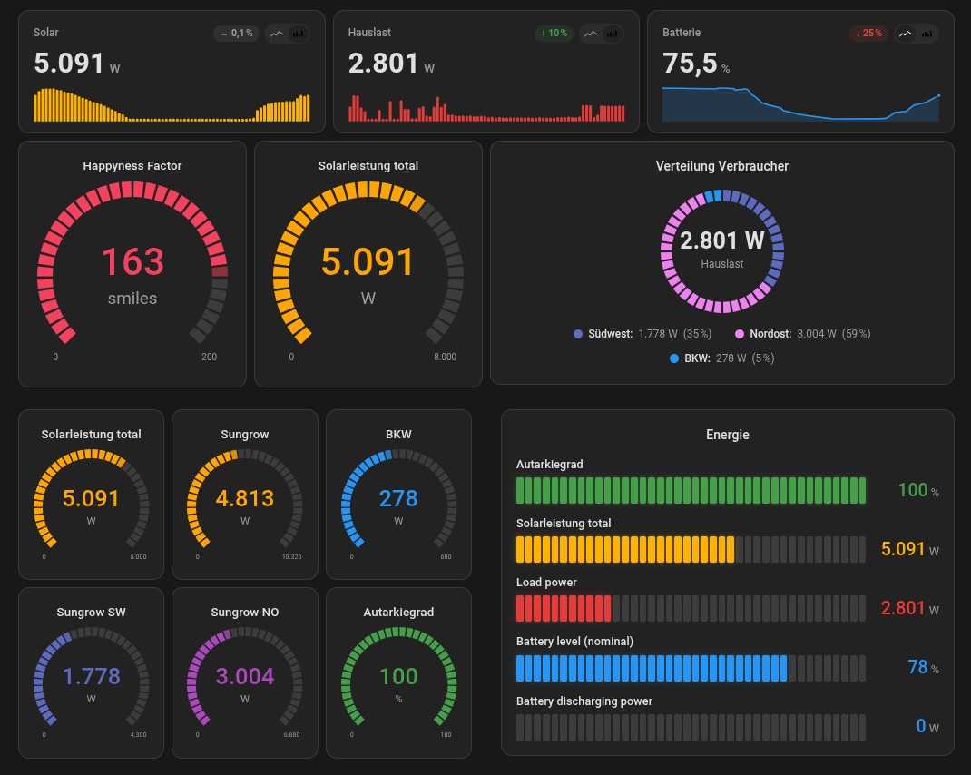
fudash-bar-card– horizontal segmented bar in "fuel-used" style, perfect for house load / solar / grid import at a glance.fudash-gauge-card– minimalistic radial gauge (3/4 circle) with optional triangle marker.fudash-donut-card– donut / pie chart for ratios (e.g. energy mix, distributions), with center label (total or any entity) and per-slice click-to-more-info.fudash-stat-card– compact KPI tile with large single value, trend sparkline (line or bars, switchable live), delta chip (compared to start of the period) and an optional min/avg/max footer.
The cards consistently use Home Assistant CSS variables (--ha-card-*,
--primary-color, --success-color, …) so they fit into any theme
(light/dark, community themes) as if they were stock components.
- In HACS: Frontend → three-dot menu top right → Custom repositories.
- Add repository
https://github.com/Afraskai/fudash-cards, type Dashboard. - Search for FuDash Cards in the HACS frontend store → Download.
- Reload Home Assistant (clear browser cache, Ctrl+F5).
- The cards appear in the dashboard editor under Add card as
fudash-bar-card,fudash-gauge-card,fudash-donut-cardandfudash-stat-card.
Updates are picked up automatically by HACS as soon as a new v* tag
is published.
Minimum Home Assistant version: 2024.8.0 (required for the
ha-form selector API).
- Copy
dist/fudash-cards.jsonto the Home Assistant server, into/config/www/(e.g. via File Editor, Samba or Studio Code Server). - In Home Assistant:
Settings → Dashboards → three-dot menu top right → Resources →
Add resource
- URL:
/local/fudash-cards.js - Type:
JavaScript Module
- URL:
- Clear browser cache (Ctrl+F5 / Cmd+Shift+R).
- In the dashboard editor click Add card and search for FuDash – all four cards appear in the picker.
After every update of the JS file, bump the cache buster on the resource URL (e.g.
/local/fudash-cards.js?v=0.15.0) or clear the browser cache.
type: custom:fudash-bar-card
title: Energy now
entities:
  - entity: sensor.solar_power
    name: Solar
    max: 8000
    color: success
  - entity: sensor.house_load
    name: House load
    max: 8000
    warn: 4000
    crit: 6500
  - entity: sensor.grid_power
    name: Grid import
    max: 6000
    warn: 2000
crit: 4000type: custom:fudash-gauge-card
entity: sensor.house_load
name: House load
min: 0
max: 8000
warn: 4000
crit: 6500
size: 200More examples: examples/lovelace-examples.yaml.
| Option | Type | Default | Description |
|---|---|---|---|
title |
string | – | Optional card title. |
entities |
list | required | At least one entity (see below). |
segments |
number | 40 |
Segments per bar. Reduced automatically on narrow columns. |
gap |
number (px) | 2 |
Gap between segments. |
height |
number (px) | 28 |
Bar height. |
animate |
bool | true |
Smooth fade-in / color changes. |
glass |
bool | false |
Glass-effect shading on segments. |
show_names |
bool | true |
Global switch: show entity names above bars. Per-entity override: show_name. |
show_icons |
bool | false |
Global switch: show icons left of bars. Per-entity override: show_icon. |
value_color |
string | auto |
auto | success | warn | crit | primary | any CSS color. |
Entity entry (entities[].*):
| Field | Type | Required | Description |
|---|---|---|---|
entity |
string | yes | Entity ID, e.g. sensor.solar_power. |
name |
string | no | Display name; falls back to friendly_name. |
min |
number | no | Scale start (default 0). |
max |
number | no | Scale end (default 100). |
warn |
number | no | Segments turn yellow above this value. |
crit |
number | no | Segments turn red above this value. |
color |
string | no | Same as value_color but per entity. |
unit |
string | no | Overrides the entity's unit. |
icon |
string | no | MDI icon shown left of the bar when show_icons: true (e.g. mdi:solar-power). Falls back to the entity's HA icon. |
show_name |
bool | no | Show name for this entity (default true). Only works if global show_names: true. |
show_icon |
bool | no | Show icon for this entity (default true). Only works if global show_icons: true. |
| Option | Type | Default | Description |
|---|---|---|---|
entity |
string | required | Entity ID. |
name |
string | – | Display name. |
min / max |
number | 0 / 100 |
Scale. |
warn / crit |
number | – | Color-change thresholds. |
needle |
bool | false |
Renders a triangle marker outside the arc as a position indicator. |
size |
number | 180 |
Size in pixels. |
segments |
number | 36 |
Segment count of the 3/4 arc (6–120). Capped automatically on small sizes. |
segment_gap |
number | 1.5 |
Gap between segments in degrees (0–8). |
show_numbers |
bool | true |
Show value + unit in the gauge center. |
show_range |
bool | true |
Show min/max labels at the arc endpoints. |
color |
string | auto |
Same as on the bar card. |
unit |
string | – | Overrides entity unit. |
| Option | Type | Default | Description |
|---|---|---|---|
title |
string | – | Optional title. |
size |
number | 200 |
Donut diameter in pixels. |
inner_radius |
number | 65 |
Inner radius in % (0 = pie, 65 = donut, >80 = thin ring). |
segments |
number | 60 |
Number of ring segments (12–240). Adjusted automatically to circumference. |
segment_gap |
number | 2 |
Gap between segments in degrees (0–10). |
show_total |
bool | true |
Show the total of all values in the center. |
center |
string | – | Optional: entity ID whose value is shown large in the center (instead of total). |
center_label |
string | Total |
Subtitle below the center value. |
show_legend |
bool | true |
Legend below the donut. |
show_percent |
bool | true |
Percentages in the legend. |
entities |
list | required | At least one entry (see below). |
Entity entry (entities[].*):
| Field | Type | Required | Description |
|---|---|---|---|
entity |
string | yes | Entity ID. |
name |
string | no | Display name. |
color |
string | no | Preset name or any CSS color. |
unit |
string | no | Overrides entity unit. |
Only positive values are plotted as a slice. Entities with value
0 or unavailable still appear in the legend but do not contribute
to the total / percentage distribution.
| Option | Type | Default | Description |
|---|---|---|---|
entity |
string | required | Entity ID. |
name |
string | – | Display name (falls back to friendly_name). |
unit |
string | – | Overrides entity unit. |
color |
string | primary |
Color for sparkline and delta glow (preset or CSS). |
hours |
number | 24 |
Period for trend, delta reference and min/avg/max (1–168 h). |
decimals |
number | auto | Decimal places; empty = automatic depending on magnitude. |
show_trend |
bool | true |
Show sparkline below the value. |
show_delta |
bool | true |
Delta chip (↑/↓/→ with %) top right. |
show_stats |
bool | true |
Min/avg/max footer below the sparkline. |
chart_type |
string | bar |
Sparkline as line or bar. UI toggle overrides this live. |
show_type_toggle |
bool | true |
Show or hide the line/bar toggle in the top-right. |
bar_width |
number | 3 |
Bar width in px (1–20). Bar mode only. |
bar_gap |
number | 1 |
Gap between bars in px (0–8). |
refresh_interval |
number | 120 |
Seconds between automatic re-fetches. |
dynamic_color |
bool | false |
Color the main value and sparkline dynamically based on the current value (3-stop gradient). |
dynamic_low_value / dynamic_mid_value / dynamic_high_value |
number | 18 / 21 / 25 |
Value stops for the gradient (must be ascending). |
dynamic_low_color / dynamic_mid_color / dynamic_high_color |
string | blue / primary / red |
Colors at each stop. Same preset names as color. |
The delta compares the current value with the first data point in the period. From 24 h onward long-term statistics are used automatically. Min/avg/max are computed over all data points in the period including the current live value.
With dynamic_color: true the main value and sparkline are colored by
a smooth low → mid → high gradient (interpolated via color-mix in
OKLCH). Values outside [low, high] are clamped to the boundary color.
Examples:
# Room temperature: cool = blue, comfortable = primary, warm = red
type: custom:fudash-stat-card
entity: sensor.living_room_temperature
dynamic_color: true
dynamic_low_value: 18
dynamic_mid_value: 21
dynamic_high_value: 25
dynamic_low_color: blue
dynamic_mid_color: primary
dynamic_high_color: red
# House power draw: low = green, medium = amber, high = red
type: custom:fudash-stat-card
entity: sensor.house_power
dynamic_color: true
dynamic_low_value: 0
dynamic_mid_value: 2000
dynamic_high_value: 5000
dynamic_low_color: green
dynamic_mid_color: amber
dynamic_high_color: redAll four cards support the same tap_action, hold_action and
double_tap_action fields as the official HA cards. Without an action
config a tap opens the entity's more-info dialog (default).
Supported action types: more-info, toggle, call-service,
navigate, url, none.
type: custom:fudash-gauge-card
entity: sensor.house_load
tap_action:
  action: navigate
  navigation_path: /lovelace/energy
hold_action:
  action: more-info
double_tap_action:
  action: call-service
  service: script.turn_on
  service_data:
    entity_id: script.toggle_kitchen
On bar and donut cards the actions can be overridden per entity
(entities[i].tap_action etc.); without per-entity actions the card
falls back to the global defaults.
Gesture timings: long-press from 500 ms, double-tap window 250 ms, movement > 8 px cancels the long-press. Keyboard (Enter/Space) triggers the tap action.
# After changes in src/, rebuild the single-file bundle:
./build.sh
# Then deploy dist/fudash-cards.js to /config/www/.
The build script concatenates the src/ modules in the right order
into a single IIFE-wrapped file – no Node, no bundler required,
just bash and cat.
Project layout:
src/
  shared/       utils, theme, base-card, data fetching (history/LTS)
  bar-card/     card + ha-form based editor
  gauge-card/   card + ha-form based editor
  donut-card/   card + ha-form based editor
  stat-card/    card + ha-form based editor (KPI + sparkline)
  fudash-cards.js   registers customElements + window.customCards
dist/
  fudash-cards.js   final shipped file
Source comments are kept in German to match the maintainer's working language, but all user-facing strings (editor labels, errors, tooltips, docs) are English.
- Bars and gauges use
role="meter"witharia-valuenow/min/max/valuetext. - On
unavailable/unknowncolors are reset and a meaningfularia-valuetextis set. prefers-reduced-motionis respected (no transitions).
Done since phase 1:
- Donut card with segmented design.
- Stat card incl. sparkline (line/bars), delta chip and min/avg/max.
- Unified segmented look across bar, donut, gauge and stat cards.
- All UI strings migrated from German to English (v0.11).
Planned:
- Energy flow card.
MIT – see LICENSE.